
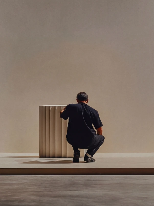


Saying you embrace a design-first approach is easy. Building a website that proves it is much harder. That’s why we wanted to talk to Squarespace Senior Brand Design Manager Serene Wong about the launch of the Squarespace Foundations website, which went live today. Every part of the site reflects the values that shape Squarespace itself. Throughout, it spotlights human creativity and a craft-led approach. Serene and the team also leveraged elements like typography, pacing, motion, grid systems, and an editorial approach to storytelling to bring it all together.
The questions she asked herself in launching the Foundations site are the same ones many Squarespace customers are asking right now: When automation/AI excels at the familiar, how do you build something only you could make? How can that site both reflect this moment and be something that lasts. Serene's insights and approach give those answers—plus plenty of inspiration, too.
What prompted the initial push to launch the Squarespace Foundations site?
The brand site hadn't been touched since 2019, and a lot had changed—both in the world and at Squarespace. We wanted the new site to reflect who we are today, not just as a company, but as a creative organization with an incredibly deep body of work. In many ways, it feels like a love letter to the creatives who have shaped Squarespace over the years, past and present.
The previous site focused more on our roots in New York, our love of typography, the principles behind the brand. This work builds on that foundation by showing the work itself. It's a more tangible expression of who we are today: a team that conceptually develops, designs, writes, produces, and builds everything internally from end to end. And as we move into an era shaped by AI and automation, it felt important to reconnect with the design-first foundations that have always defined us.
What was your initial reaction to the project—what excited or challenged you most?
Defining a brand is always both exciting and intimidating — you're trying to distill something living and constantly evolving into a single expression that defines the brand to the world.
I had just joined Squarespace when the project started, so it became this immersive way of learning the brand from the inside out. Like being handed the keys to the archives and tracing the craft and momentum that brought Squarespace to where it is today.
What made it especially interesting was that this wasn't a rebrand—it was an articulation. In some ways, that's harder. A rebrand gives you the freedom to construct something entirely new, but articulating what already exists means working with something alive. You're not building from scratch; you're making the invisible visible.
What’s your interpretation of the role of this microsite within the broader Squarespace ecosystem?
I think of it as a creative and cultural anchor. As Squarespace continues to evolve across products and technology, the site creates a dedicated space to express the principles, craft, and perspective that hold the brand together—a place where the "why" behind the work lives.
It's also a celebration of the collective creative output behind Squarespace, past and present. We wanted it to feel inspiring not just for the creatives shaping the brand internally, but for the customers and entrepreneurs building their own brands on the platform too.

Squarespace Foundations, a celebration of collective creative output.
The guidelines emphasize cohesion—what does “cohesion” actually look like in practice across a site like this?
When we first kicked off the project, one of the funny things I kept experiencing was that the brand was described as “you know it when you see it.” Squarespace had been built visually from the start. The challenge was figuring out how to articulate and systematize that more clearly.
For us, cohesion wasn’t about making everything look the same. It was about the consistency of that feeling—every part of the site coming from the same creative point of view, from typography and motion to voice and interaction design.
How did you translate abstract brand principles like “design as a competitive advantage” into tangible site elements?
If you believe design is a competitive advantage, the site itself has to prove it—not just visually, but in every considered detail. That showed up in the typography, pacing, motion, grid systems, and editorial approach to storytelling.
We were intentional about making every interaction feel considered rather than excessive. Even small things—how content breathes, how transitions feel, how imagery is framed—all reinforce the idea that thoughtful design shapes how people perceive and ultimately trust a brand. The philosophy and the execution had to be the same thing.
Squarespace has always been “design-first.” How did that philosophy influence your decisions throughout this project?
It shaped almost everything. Being design-first isn't just about how something looks—it’s also about how it works. It's about approaching every part of the experience with intention, from the systems and structure down to the smallest interactions.
A big part of that is knowing when to hold back. One of the hardest design decisions is restraint—choosing not to do something. We thought a lot about pacing, breathing room, and when to let the work speak for itself, so the experience felt confident and immersive rather than overly designed.

Typography on the Squarespace Foundations site.
What were some of the most important design details that might not be obvious at first?
At first glance, the site reads almost like a portfolio—a curated showcase of work across the brand. But the longer you spend with it, the more you realize it's also functioning as a living expression of the brand system itself.
The most meaningful details are embedded subtly throughout. Small interactions and Easter eggs reveal the systems and thinking behind the brand—interactive moments that show how color palettes are sourced and refined, modules that invite you to experiment with our bespoke type family. What looks like a static grid of imagery is actually a live, movable canvas inspired by an evolving creative moodboard. We wanted the experience to reward curiosity—to give more, the longer you look.
How did the approach on typography, motion, or color evolve in this site compared to previous iterations?
The previous version lived primarily in black and white, with motion coming through animated assets. With this launch, we wanted the site to feel more dimensional while staying true to Squarespace's core visual language.
We kept black and white as the foundation, but introduced light and dark modes that shift based on the time of day in New York City—a small detail that adds a layer of life to the experience. Color came through the work itself rather than being imposed on the system. Typography leaned into more editorial layouts, scale, and pacing. And motion extended beyond animation into transitions and interactive moments—less decorative, more structural.
Can you walk us through a specific section or element that best captures the spirit of the brand?
For me, the homepage. Each chapter in the homepage carousel functions as both a preview of a specific part of the brand system and a small interactive experience that rewards curiosity and exploration.
That felt very true to Squarespace—thoughtful and expressive, but never demanding. You can go deeper into each chapter, or simply move through the carousel passively, and still come away with a strong sense of the brand's personality and perspective. It doesn't force the experience on you. It invites you in.

The Squarespace Foundations homepage.
What did collaboration look like across teams on this project?
It was incredibly exploratory and collaborative. There were a lot of shared references, inspiration pulls, jam sessions, and open conversations about what role the site should play within the broader brand ecosystem.
A big part of the process was challenging traditional ways of thinking about the brand, and prototyping ideas directly through motion and interaction rather than relying solely on static design. We wanted the experience to feel interactive and alive, but still visually restrained—using motion where it added meaning, while allowing static moments to create breathing room and balance throughout the site.
How did feedback shape the final outcome—was there a moment that significantly changed the direction?
Feedback was essential in narrowing the focus. An open brief is often the hardest kind of project precisely because the possibilities feel endless. Early on we explored a lot of directions—traditional brand guidelines felt too rigid and prescriptive; high-impact and visually loud didn't feel true to us.
As the project evolved, we kept pulling toward something more editorial, refined, and quietly expressive. The final site became less about explaining the brand and more about creating a space where people could simply experience it. That shift in framing—from explanation to experience—was probably the most important one.
The brief mentions an “increasingly automated creative landscape.” How did that idea influence your approach?
As we move into an increasingly automated and generative creative landscape, it felt even more important to stay grounded in what has always defined Squarespace: thoughtful, design-forward work made by humans.
That idea influenced a lot of our approach to the site. Squarespace Foundations became an opportunity to establish and celebrate the creative foundations we want to carry into the next era of technology and AI—emphasizing craft, perspective, taste, and human creativity. A big part of the experience was showcasing the breadth of work created by our in-house teams and reinforcing the idea that while tools and technology will continue to evolve, human creativity and judgment remain at the center of the brand.
Why do you think it’s important for Squarespace to double down on design right now?
Because the value of a human point of view goes up as automation goes up. Technology can enable creativity, but strong ideas, genuine taste, and emotional resonance still come from people—and that's what makes brands actually memorable.
Squarespace has always been craft-led, and I think that becomes more of a differentiator as the landscape shifts, not less. This felt like exactly the right moment to reaffirm that.
Looking back, what part of the project are you most proud of?
Honestly, that it feels distinctly Squarespace. Editorial yet restrained, expressive yet intentional—it hits the balance we were aiming for in a way that feels true to the brand without feeling self-conscious about it.
But more than the outcome, I'm proud of the collaboration behind it. So many people across disciplines helped shape this experience, and I think you can feel that level of care throughout. It doesn't feel like it was made by one person or one team—and that's exactly right.
What’s the overall emotion you feel looking at the finished site? What do you hope others will feel when they land here?
More than anything, I hope people walk away with an appreciation for the craft and collaboration behind the brand—and feel moved to make something of their own.